


About Synapse
Synapse is a new physiotherapy practice in the heart of Paris’s 11th arrondissement, between Place de la République, Boulevard Magenta and the Canal Saint-Martin.
Moving away from the traditional, austere codes of the medical sector, Synapse draws on the warm, carefully designed spirit of Parisian coffee shops and neighbourhood hangouts. The aim is a modern, welcoming and beautiful care experience, designed with a cosmopolitan, English-speaking clientele in mind.
Concept & Vision
In anatomy, a synapse is the zone where two neurons interact and transmit: the precise point where a signal travels and communication is established.
The practice builds its approach on this key idea of connection:
- Reconnecting with oneself. An educational approach that helps each patient understand their body, their movement, the origin of their pain and the importance of the right gesture.
- The practitioner–patient bond. A relationship of listening and tailored support.
- A medical network. A strong network with the health professionals of the neighbourhood.


Art Direction & Visual Identity
The identity was designed to reflect a balance between scientific rigour, elegance and human warmth.
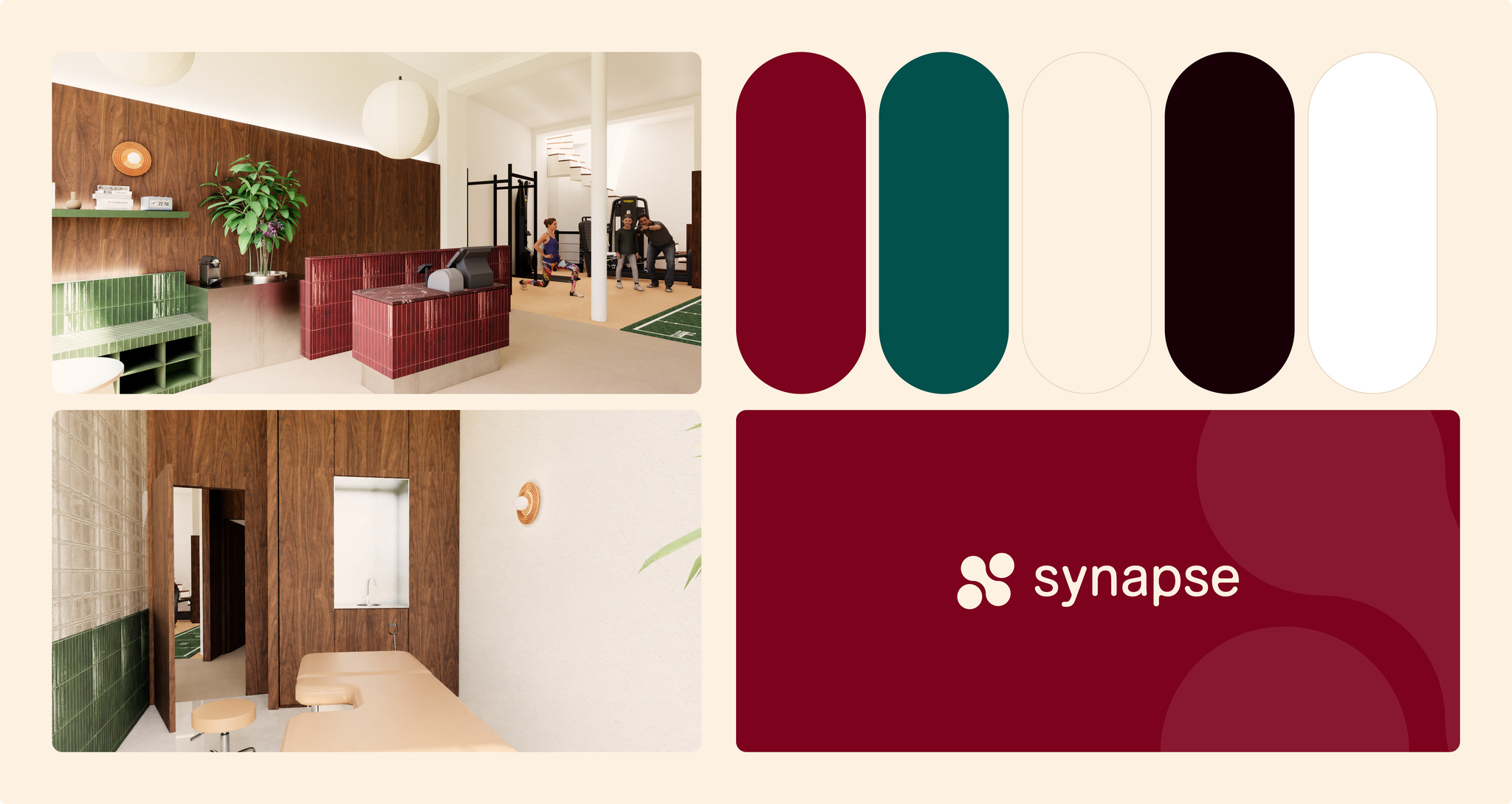
- Colour world. A bold palette that echoes the physical space: glossy red and green tiles, glass, and the warmth of walnut. A deep red as the primary colour, a green as the secondary colour and a soft beige as the neutral.
- Symbol and logotype. A clean symbol of connected, interlocking shapes, embodying transmission, paired with a structured, contemporary wordmark. It works in horizontal and vertical versions, on its own as a logomark, as an oversized tone-on-tone background and as a pattern.
- Typography. Alte Haas Grotesk, in Regular and Bold: structured, clear and contemporary.
- Icons. A custom set of ten icons for the practice: spine, joint, strength, massage, rhythm, walking, movement, appointment, care and breath.
- Applications. Stationery, patterns and an animated logo.
Pattern & Motion
The logomark can be repeated into a pattern or scaled up as an abstract background. An animated version brings the idea of connection to life: the shapes come together, move in waves, then multiply into a field of marks that spin in opposite directions.
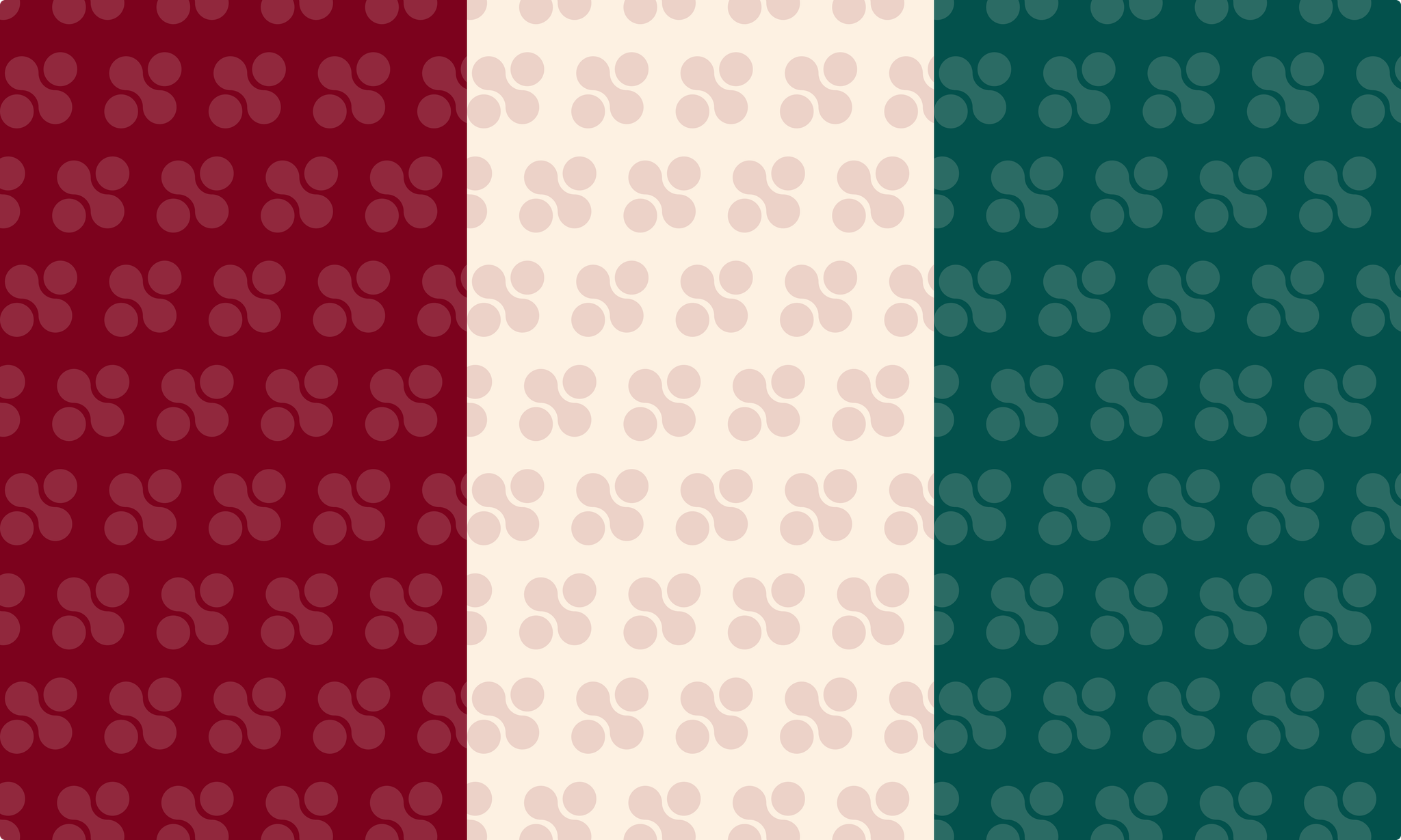
Each colour comes with a full range of tints and shades for backgrounds, patterns and tone-on-tone effects. Red and green lead the identity, while beige gives it room to breathe.
Shapes & Curves
The logomark is made of rounded shapes joined by smooth curves, like neurons reaching toward each other. This language of circles and soft joins runs through the whole system: the oversized, cropped marks used as tone-on-tone backgrounds, the repeating patterns, the pill-shaped colour swatches and the rounded corners of every format. Nothing is sharp; everything is built to feel welcoming.


Typography
The identity uses Alte Haas Grotesk, in Regular and Bold. It is a grotesque typeface with a structured, contemporary feel and slightly organic edges, which keeps it clear and professional while staying warm. The wordmark itself is drawn as artwork and is never retyped.


