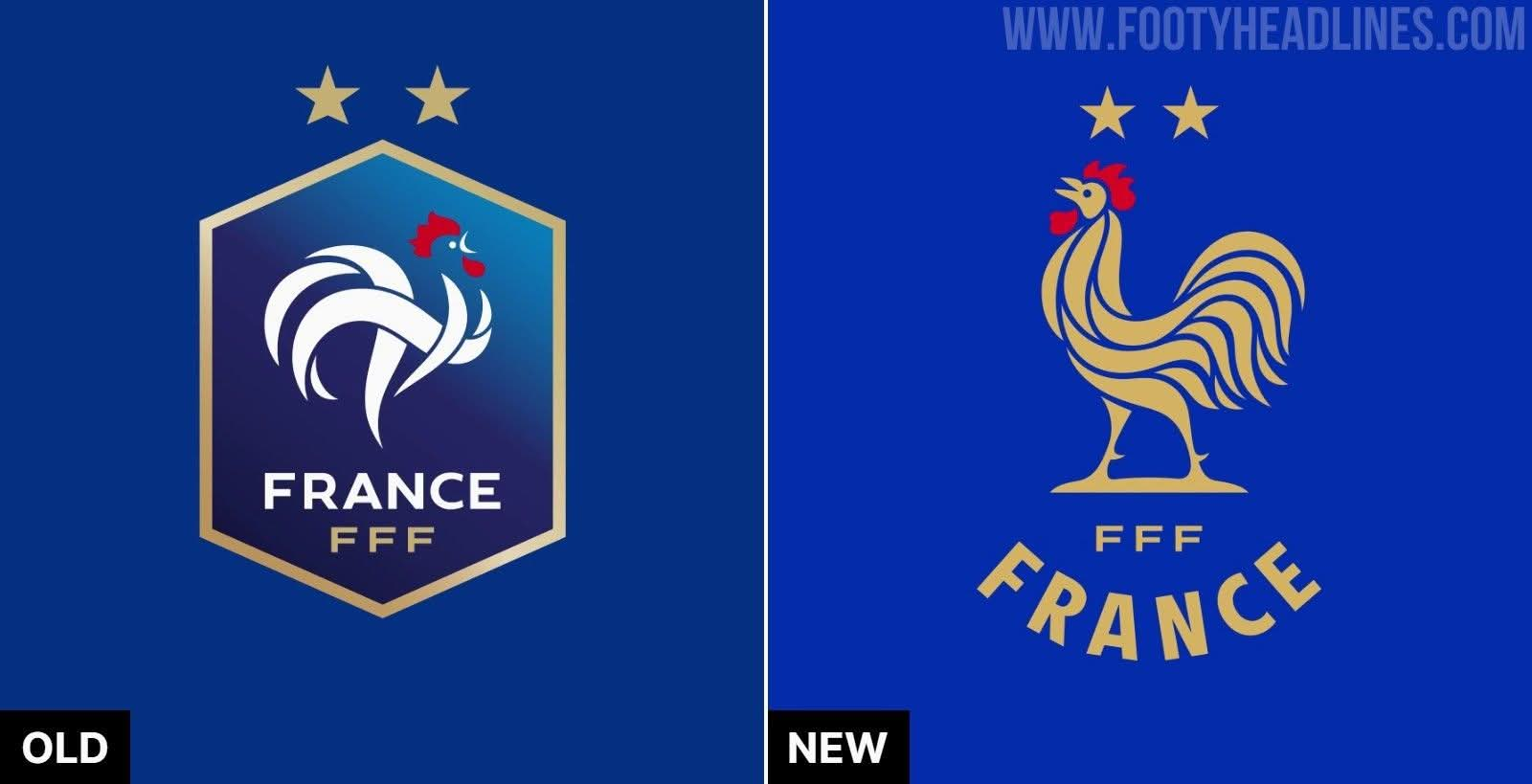
Last summer, the French Football Federation (FFF) unveiled its new visual identity. At first glance, the update might seem subtle. Yet, it hides a graphic detail that almost nobody will consciously notice, but everyone will feel: the rooster now faces left.
For anyone working in design or branding, this choice feels like a mini-earthquake.
The Golden Rule of Design (and Why the FFF Broke It)
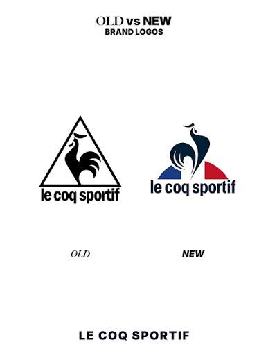
In brand design, profile symbols and mascots almost always face right. Why? Because in Western reading culture (left-to-right), the right symbolizes the future, progress, momentum, and what’s coming next. It’s the exact reason Le Coq Sportif chose a right-facing rooster for its emblem.
So why did the FFF decide to go against this fundamental design instinct?
The answer isn’t rooted in complex symbolism—it comes down to pure, pragmatic consistency.
A Decades-Old Mismatch
For years, a quiet inconsistency existed within the FFF brand:
- The official institutional logo faced right.
- The rooster embroidered on the jersey—the one millions of fans actually watch for 90 minutes—has always faced left.
Two roosters, two directions, two brand identities running parallel for decades without ever aligning.
The FFF made the call: the institutional logo now follows the jersey, not the other way around. The shirt is the beating heart of the brand and its strongest touchpoint with fans. Aligning the two instantly brings clarity and cohesion across every platform, from digital screens to physical merch.
Historical Heritage & Brand Unity
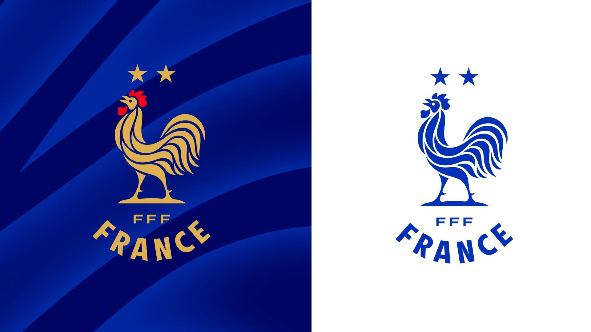
This shift is also a nod to history. The rooster’s updated silhouette draws directly from the earliest FFF logos of the 1920s, bridging heritage with a modern aesthetic.
Even bigger is the structural shift: for the first time, every national team (men’s, women’s, youth) shares the exact same emblem, distinguished only by a small label underneath.
The Key Takeaway
At first glance, turning a logo to the left breaks traditional branding rules. But this redesign proves a vital point: sometimes brand unity and real-world coherence matter far more than theoretical symbolism.
It’s a bold, grounded choice that proves simplicity is often the ultimate form of brand maturity. 🐓