Can you make it like Wiz? and why I won’t
As a graphic designer working in the tech industry, there is a specific question I hear in discovery meetings all the time:
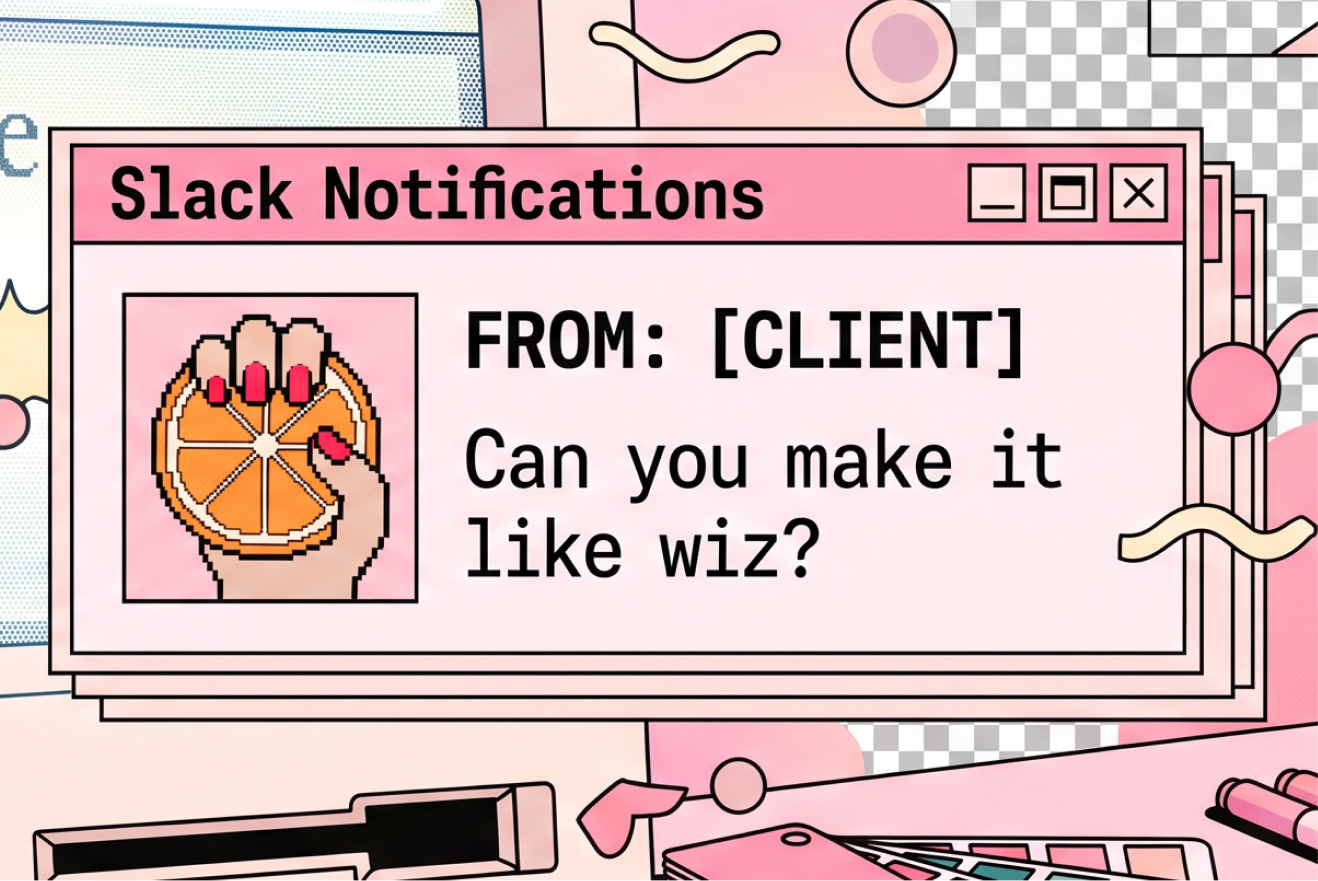
”Can you make our brand look like Wiz?”
My response is always gentle, but firm: You are not Wiz. You aren’t magical, you don’t have a wizard mascot, and a playful, illustration-heavy visual world likely has nothing to do with what your company actually does.
Wiz’s branding works brilliantly because they found their core identity and leaned into it with total confidence. They embraced a distinct personality in an otherwise dry, sea-of-sameness cybersecurity market. Replicating their visual language won’t make you look successful—it will just make you look like a copy.
The Sea of Tech Homogeneity
Too many tech startups fall into the comfort trap of visual mimicry. When a company rises to unicorn status, its aesthetic suddenly becomes the default blueprint for everyone else:
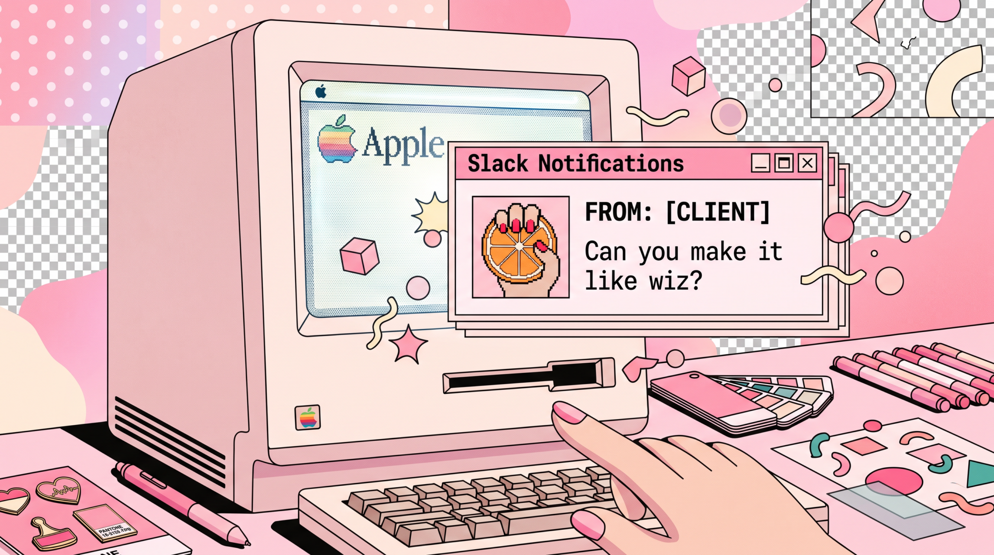
As a graphic designer working in the tech industry, there is a specific question I hear in discovery meetings all the time: ”Can you make our brand look like Wiz?”
- The Cyber-Security Template: Dark mode, neon purple glowing grids, and floating 3D glass shapes.
- The B2B SaaS Template: Bento grids, fluorescent yellow CTA buttons, and rounded geometric fonts.
- The AI Template: Dark slate backgrounds, subtle gradients, and three glowing sparkle icons.
- What is the fundamental problem you solve differently?
- Who are your specific users, and what emotion should they feel when interacting with your product?
- What is your company’s unique voice in a crowded room?
When startups copy these trends, they trade their distinctiveness for safety. They want to look like an established winner to earn fast credibility, but they end up blending into the background entirely. Why Visual Copying Kills Your Growth Brand identity isn’t just a surface-level coat of paint; it is the outward translation of your core value, culture, and strategy. When you ask a designer to copy another market leader, you miss the opportunity to answer the most important strategic questions:
Who started the trend?
The Echo Chamber of Visual Homogeneity
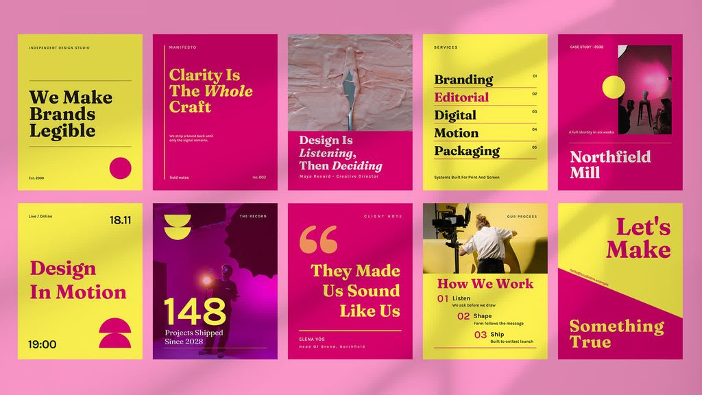
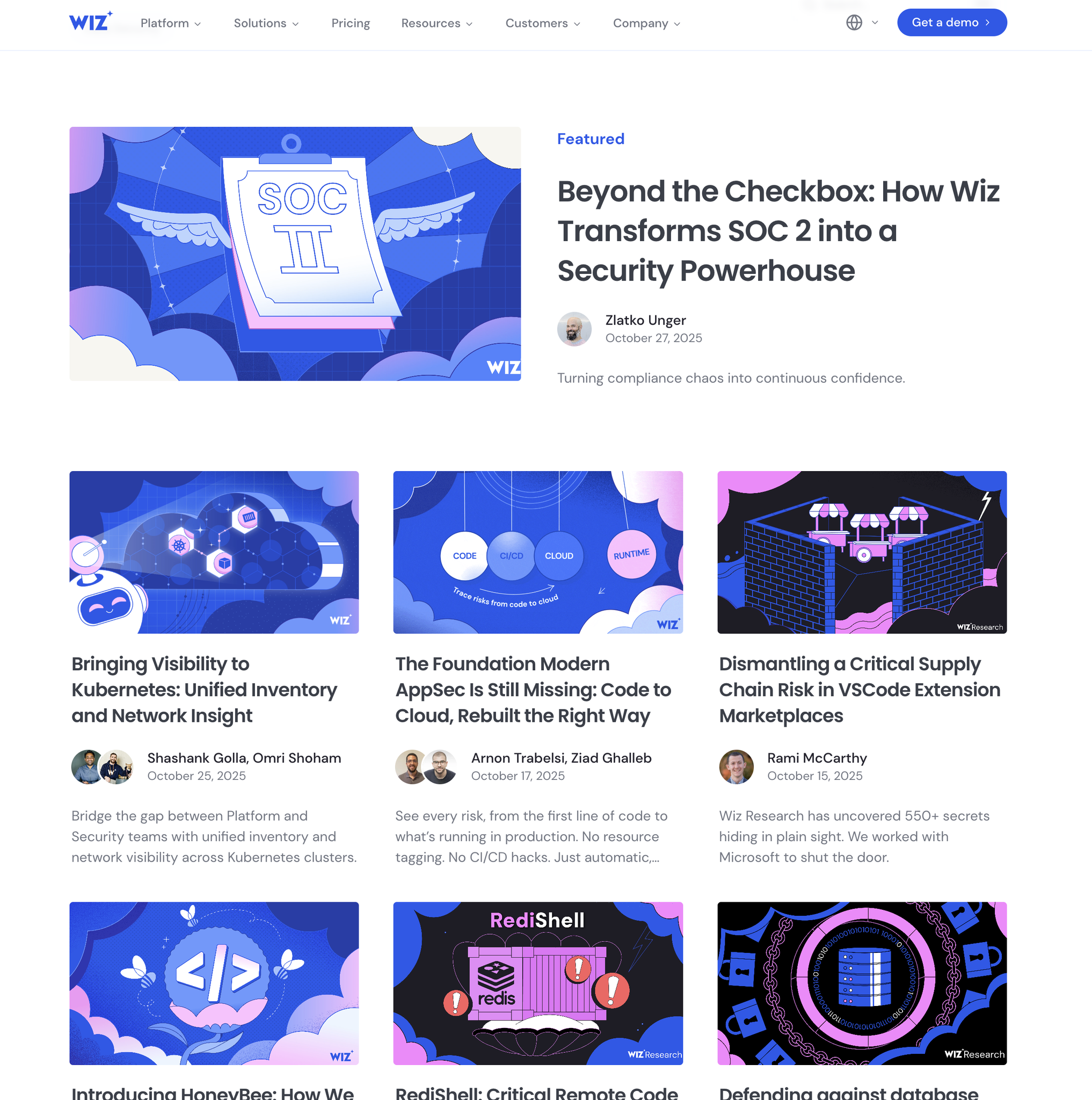
Look across the modern B2B and cybersecurity landscape today, and you’ll spot a unmistakable pattern. When Wiz exploded onto the scene, they didn’t just disrupt cloud security; they broke the unwritten rule that enterprise tech had to look like a blue-tinted corporate brochure. They brought bold high-contrast palettes, heavy character illustrations, and editorial editorial-style typography to a category desperate for personality.
Naturally, the rest of the ecosystem took notes.
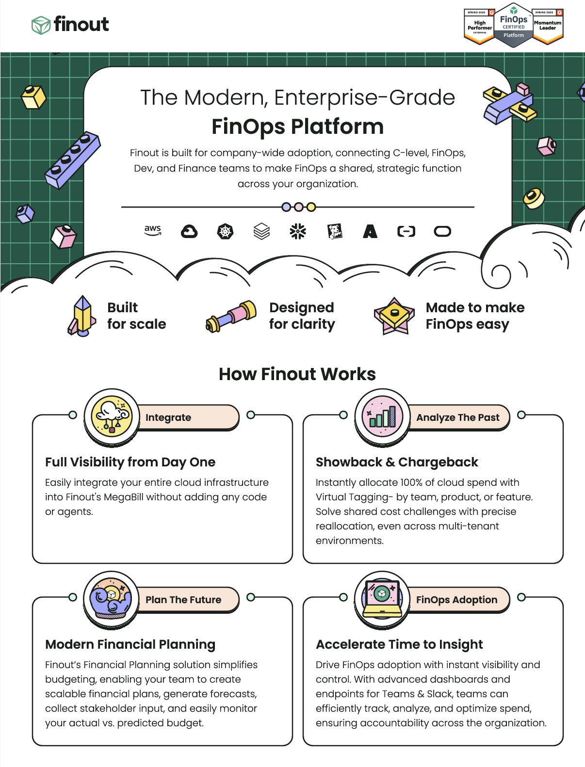
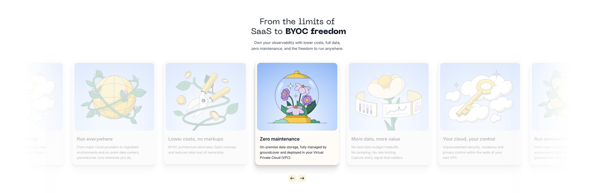
Today, brands like Groundcover, Cyera, Finout, and Mirror, among dozens of others have adopted a near-identical aesthetic blueprint. Dark modes, vibrant neon accents, chunky retro-modern typography, and stylized character mascots have become the new default.