Tinder’s Rebrand: Great Design, but Does It Solve the Real Problem?
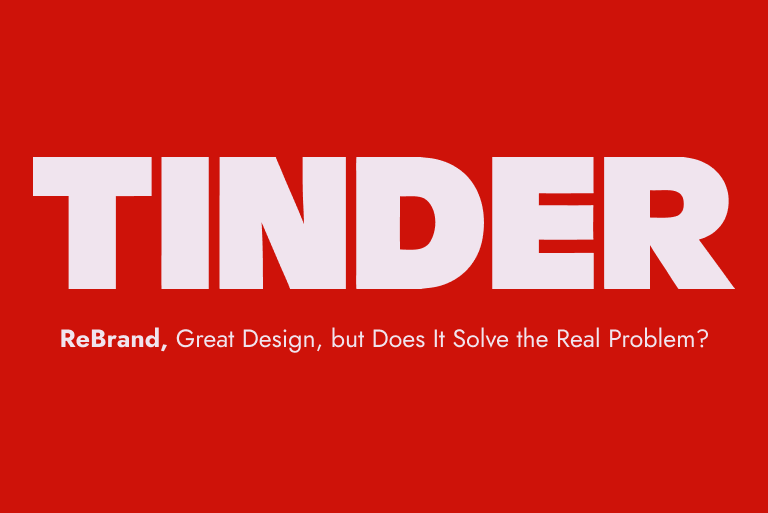
Tinder recently unveiled its first major rebrand in nearly a decade, created in collaboration with Porto Rocha. Featuring an all-caps wordmark, a sharper flame icon, an expanded color palette, and a new editorial tone, the visual refresh is undeniable. Visually, it’s executed exceptionally well.
As an Art Director, I love seeing a heritage digital brand modernize its visual language. But as a product designer, I can’t help but ask the strategic question: Does a rebrand actually solve Tinder’s core user problem? The Core Strategic Disconnect The generation Tinder is trying to win back (Gen Z and young Millennials) isn’t leaving dating apps because the UI feels dated or the typography lacks editorial polish. They are leaving because of profound dating app fatigue. Today’s users are facing systematic frustrations:
Trust & Safety
Skepticism around privacy, data use, and fake profiles.
“Distinctive design starts with something true, not something trendy.”
Burnt-Out UX
The gamified “swipe fatigue” where endless choices lead to low-quality connections.
- One expressive colour, one grounding colour
- A clear type hierarchy
- A recognisable image treatment
Clarity makes a website useful. Personality makes it unforgettable. You need both.
Category Cynicism
A growing belief that the app’s incentives align with keeping users single rather than helping them find genuine relationships.
Branding vs. Product Reality
A strong identity system can transform brand perception and reignite cultural relevance. However, visual identity alone cannot fix structural, product-level distrust. If the underlying user experience and algorithm remain unchanged, a sleek visual refresh simply puts a modern layer over a system users are already exhausted by. The Designer’s Takeaway Tinder’s new brand system is a masterclass in modern art direction and motion design. Yet, it serves as a powerful reminder for design leaders: Design cannot exist in a vacuum. When a product faces category burn-out, visual repositioning must be deeply tied to product-level innovation and business model shifts. It will be fascinating to watch whether this visual transformation successfully moves the needle on user retention, or if it proves that branding was never the primary issue to begin with.